Digital Glitch PosterPhotoshop
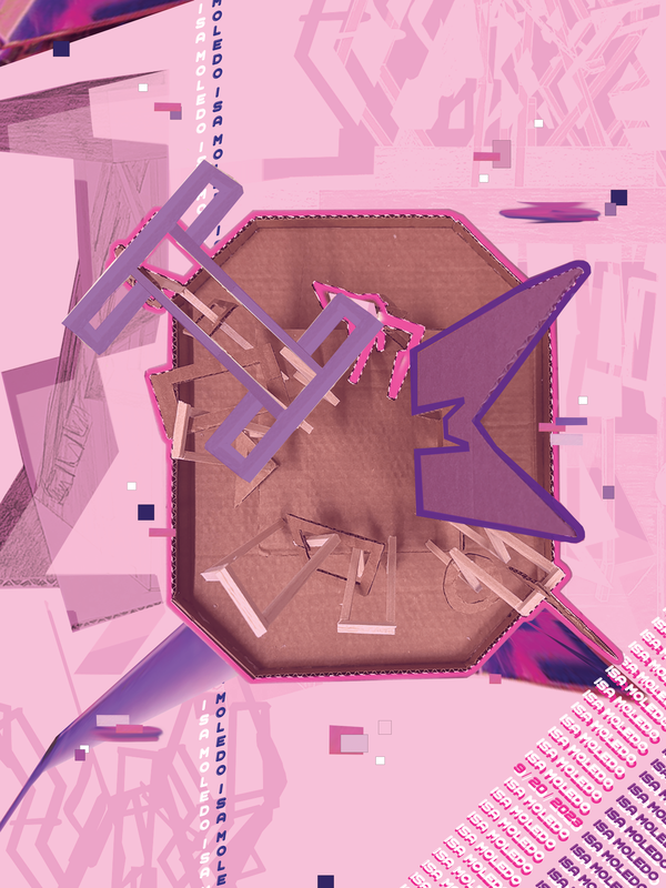
61 x 45.5 cm The assignment was to create another poster, this time in photoshop, inspired by our helmets and incorporating glitch art style. We were also told to use typography of some kind to represent either our name or a message.
This was my first time using photoshop and I can say it was definitely a challenge but I knew I wanted to use the opportunity to experiment with perspective. With that in mind I settled on having the top of my helmet the focus. I contemplated using red as my main color, contrasting the blue that I had previously used but when refining my idea I thought pink would suit my vision better as it adds a sort of fun, young, and feminine feeling that compliments the themes present in the helmet. My idea was to create a monochromatic look with the pink, using many transparent and textured layers to add contrast and "glitchiness". In the end I added some purple to better highlight important elements of my poster, like the typography. For the typography I recognized that the wood and cardboard elements of my helmet could act as the initials of my name. The "M" was already set but I used the polygonal lasso tool to create other wood pieces to form my uppercase "I". I also used text to add more variety around the model and tiny, multicolored pixels to represent the glitch style. The background consists of layered photos of the helmet right-side-up to add interest. If I had to edit the project I would attempt to include typography in the background and add more distortion to amplify the glitch component. Overall, it's not my favorite project and I think I'll be holding off the pink for a while but it was a cool experience.
|
|
